Olist Sales and Products Report
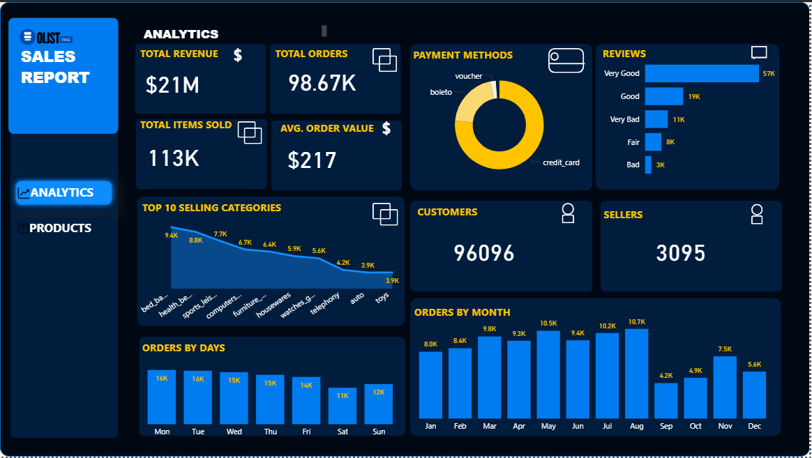
The "Analytics" section focuses on key sales metrics, order trends, payment methods, and customer/seller engagement. It highlights overall revenue, order volume, average order value, and top-selling categories. The "Products" section delves deeper into the product catalog itself, presenting statistics on the number of unique products and categories, average product weight, and the distribution of products across categories. This dual-panel approach allows stakeholders to gain a holistic understanding of both the operational and product-centric aspects of the business.
The creation of this dashboard involves several key steps in Power BI, starting with data loading and transformation, followed by data modeling, and finally, visualization. The Olist dataset, being relational, necessitates joining multiple tables to consolidate relevant information. For instance, to calculate "Revenue by Category," the olist_order_payments_dataset (containing payment values) is merged with olist_order_items_dataset (to get product_id for each order) and then with olist_products_dataset (to link product_id to product_category_name). This merging process is primarily handled in Power Query Editor, where data types are cleaned, and new columns (like product_id and product_category_name in the payments table context) are expanded from the joined tables.
After data transformation, a robust data model is established by defining relationships between the various tables based on common keys (e.g., order_id, product_id). This allows for seamless cross-table filtering and calculations. Crucially, to prevent over-counting revenue due to duplicated payment_value when an order has multiple items, a DAX measure (Revenue by Category = SUMX(SUMMARIZE('MergedPaymentsTable', 'MergedPaymentsTable'[order_id], 'MergedPaymentsTable'[payment_value]), 'MergedPaymentsTable'[payment_value])) is employed. This measure first aggregates payment_value at the unique order level and then sums it up, ensuring accurate revenue figures when broken down by dimensions like product category. The final step involves designing intuitive visuals, like bar charts for category distribution and key performance indicator (KPI) cards for summary metrics, to present these insights effectively on the dashboard pages.